When design flops

What have the Google Glass, Siamese wine glasses and a mirror for the Mythomaniac in common? They were all Flops! But they also give us pause to reflect on the reasons for their inadequacy. What is it that makes an innovation a success or a failure? How can failures serve innovation? What triggers appropriation of an item by its users? Flops are useful pointers in trying to grasp the issues involved in the creative process. They can also help us to understand what gives another product cult status when it chimes exactly with the dreams and desires of a society. The exhibition Flops! When design gets tangled up offers you an informal and humorous look at the flops of design.
Mistakes are almost always of a sacred nature. Never try to correct them.


The Unlikely
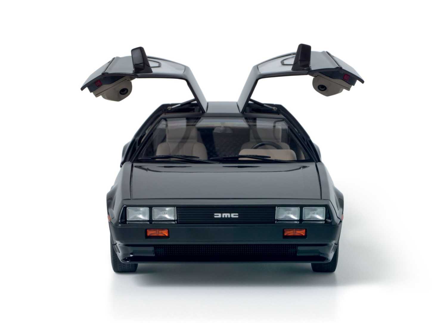
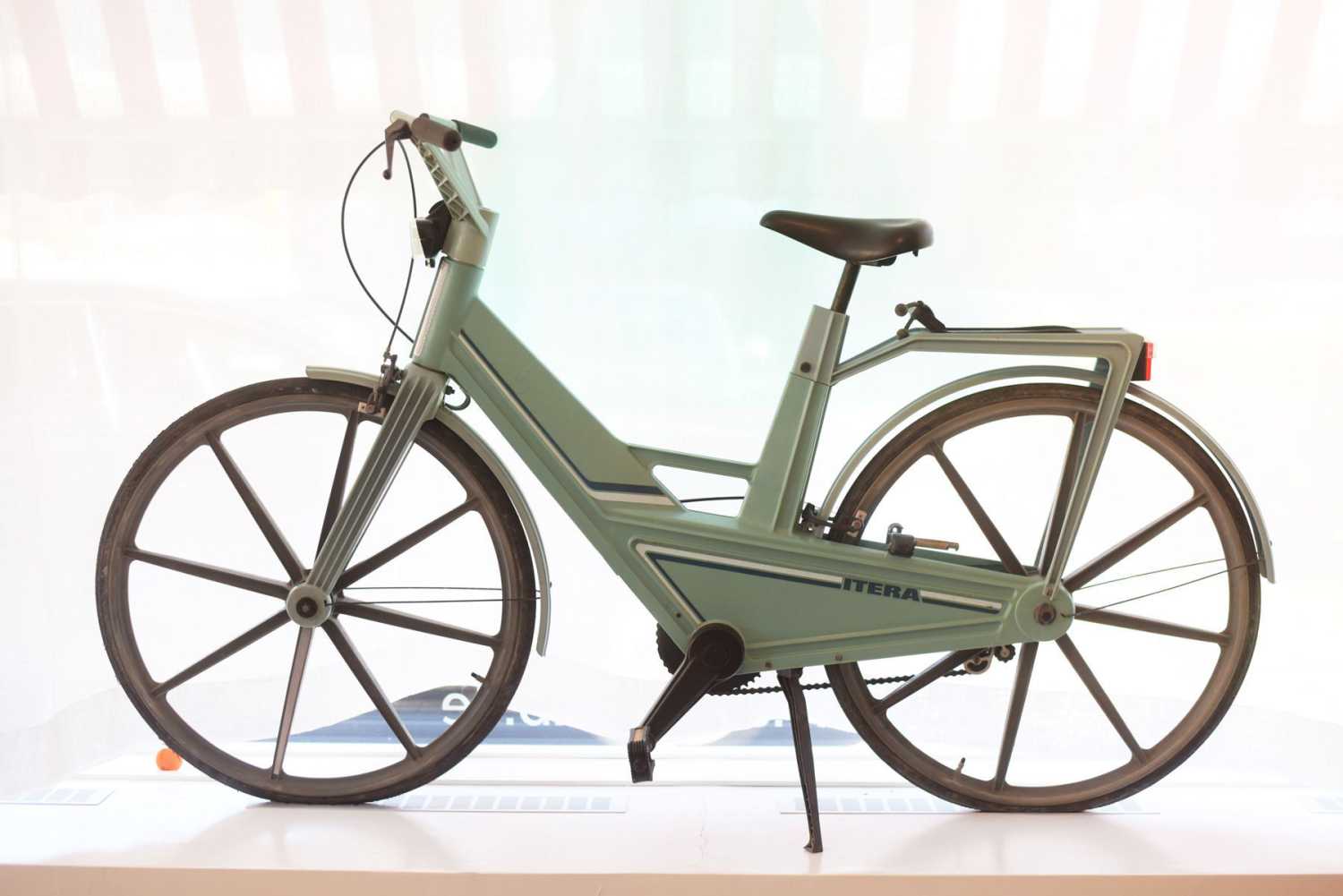
But how did they get on the market? In retrospect, the very existence of the forty products on display seems highly improbable. The proof? They are all flops, spectacular commercial or financial failures, with one thing in common: their use is problematic. Their usage is difficult, awkward or even impossible. Between their conception and their launch, the design has failed or has simply been forgotten. The designers' questions - "what is it for? what does it evoke? what environment does it fit into? what need does it meet? - were not asked, were not heard, or never led to the project being requestioned.
As a result, errors from different fields - design, management, technical or technological, materials - have all hindered reliability of the product or its adoption by users. All these mistakes are not the end of the story. Taken into account, analyzed, dissected in a design process with the user at the center, they have sometimes served as the basis for great successes. This is one of the lessons learned by Samuel West, founder of the Museum of Failure opened in 2017 in Sweden, and from which the selection of objects presented is sourced.


The untraceable
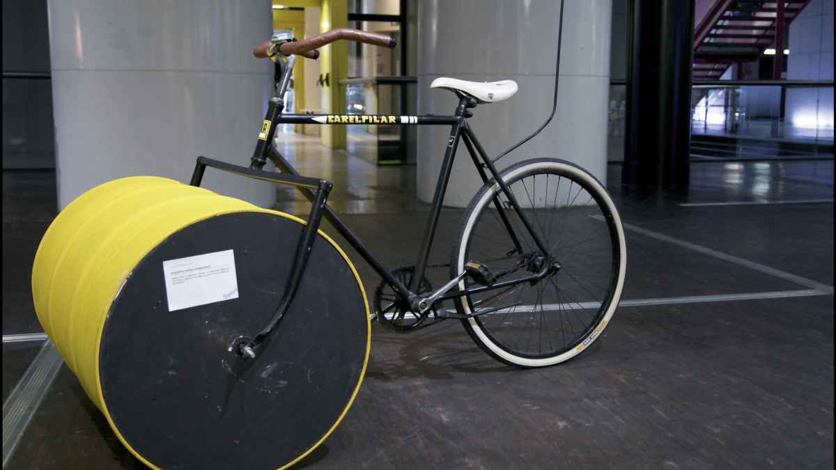
Their forms are unusual, their names surprising and their function always special. Issued or inspired from Jacques Carelman's Catalogue of unfindable objects, all these machines, tools, utensils or devices are deprived of any functional ambition. If they are used, it is to laugh or to cry, to question the origin of the machines or perhaps to discover the reason behind it all. The only certainty is that they are "perfectly unusable," as the illustrator and pataphysicist said on the back cover of his book. It's up to you to test these objects, through your actions or imagination. To detect their biggest flaws or their best intentions. They are "the opposite of those gadgets that our consumer society is so fond of," Carelman wrote. They have originated from the famous catalog "Manufrance, Manufacture française d'armes et cycles" which he used to flip through as a child and which "gave him [his] first and unforgettable poetic emotions" thanks to these strange objects with unknown functions and barbaric names.
The Uncomfortable
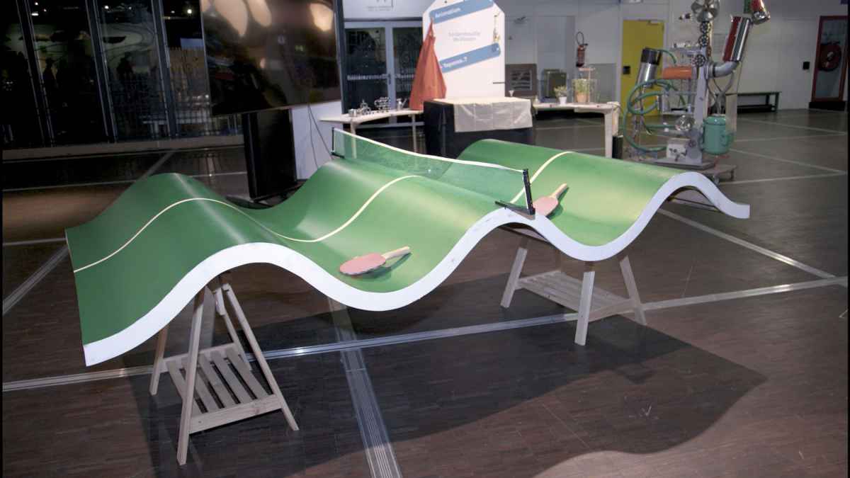
Deconstructing the invisible language of design in our domestic reality, Katerina Kamprani makes slight modifications to the fundamental properties of simple everyday objects, and questions our expectations regarding functionality. Established conceptual models are broken, leading to appreciate the conventional through faulty design. The semiotics of the original object is maintained, but the observer is deceived when he tries to simulate its functioning. It upsets his expectations and gives these everyday objects an uncomfortable, absurd, and often surreal aspect. Reconciling humor, art and design, Katerina Kamprani analyzes and redesigns everyday objects to make them uncomfortable.
Votre navigateur est obsolète, l’affichage des contenus n’est pas garanti.
Veuillez effectuer une mise à jour.
